CCHAINED /
CCHAINED /
CCHAINED /
The crypto market, while growing, presents significant UX challenges for new users. The main problem is that most platforms have complex information architecture and feature bloat, which puts a heavy cognitive load on users. This project, CChained, was designed to solve these usability issues by creating a simple and intuitive app for crypto trading and portfolio management. The goal was to build a product with a smooth user journey from start to finish.
Category:
End-to-End Web3 Product Design
Client:
CCHAINED
Duration:
8 – 9 Weeks
Location:
São Paulo, Brazil
Problem Statement
In a crowded and complex cryptocurrency market, most trading and portfolio management applications fail to deliver a user experience that meets the needs of a diverse user base, particularly those new to the space.
Existing platforms are characterized by cluttered interfaces, complex information architecture, and a high cognitive load. This creates significant friction in core user journeys like buying, selling, and managing a portfolio. As a result, users are often overwhelmed, leading to a high barrier to entry and a fragmented, frustrating experience.
The core problem is to design a solution that simplifies these complex processes, providing a streamlined, intuitive, and secure platform that empowers users to confidently manage their crypto assets without compromising on a professional, data-rich interface.
Competitive Analysis & Benchmarking
I conducted a competitive analysis and heuristic evaluation of major platforms like Binance, Coinbase, and Kraken. This benchmarking helped find pain points and opportunities for design innovation.
Coinbase wins on simplicity. Its clean UI and easy onboarding flow make it the go-to for beginners. The main downside is higher fees and a limited asset selection, creating a usability-utility trade-off.
Binance is the market leader, with a huge range of features and high liquidity. However, its complex information architecture and cluttered UI lead to a high cognitive load, making it a poor choice for new users.
Kraken is all about security and low fees for experienced traders. Its biggest UX weakness is a dated visual design that doesn't meet modern standards, making it less intuitive.
My project aims to bridge the gap by combining Coinbase's user-friendliness with the utility of a professional platform, solving key pain points across the industry.
Key Research Insights
My research, including secondary research of user reviews, showed me a few key things:
Feature Bloat: Too many features lead to high cognitive load, which can cause user errors.
Usability-Utility Trade-off: There's a gap between apps that focus on utility (lots of features) and those that focus on usability (ease of use). CCHAINED app needed to do both.
User Journey: Most apps have a fragmented user journey, which we aimed to fix by keeping everything in one place.
Solution & Results
CChained was designed as a direct response to the key user pain points and market gaps identified during my research. My goal was to create a full solution that delivers a superior user experience by prioritizing simplicity, clarity, and transparency. This design approach aimed to not only solve existing problems but also to set a new standard for modern crypto application.
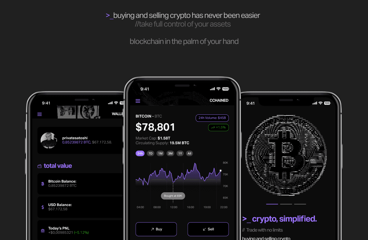
How CCHAINED Is Better?
The app's interface is both user-friendly and visually appealing. It uses a minimalist aesthetic with a subtle hacker-inspired visual language. This style has a purpose:
Usability and Affordance: The UI design uses visual affordance with clear signifiers and a strong visual hierarchy. The smart use of negative space reduces visual clutter. The dark mode is an accessibility feature with a high-contrast ratio to reduce eye strain.
Brand Identity: The hacker aesthetic gives the app a unique brand identity that connects with the mental models of its tech-savvy audience.
The Unique CCHAINED Aesthetic and Delivery
The final product offers a better experience by solving the weaknesses of other apps:
Simplified Transaction Flow: The trade screen is a task-oriented interface. Its clear CTA (Call to Action) and smooth user flow make it efficient. The "Recents" section also improves discoverability.
Transparent Portfolio: The WALLET screen acts as a clear dashboard, showing key information like total value and PNL. This design provides a complete information scent and is a great UX improvement.
Intuitive Navigation: The global navigation bar is designed for efficiency. By adding WALLET as a navbar item, i gave users quick access to a key feature. Using the same handmade arrow icon for Buy, Sell, Send, and Transfer shows strong design consistency and solves the problem of icon ambiguity.
The project was built using an iterative design process. The Figma high-fidelity prototype shows the final product, which proves that a design-led approach can solve complex UX problems and create a valuable app.

Problem Statement
In a crowded and complex cryptocurrency market, most trading and portfolio management applications fail to deliver a user experience that meets the needs of a diverse user base, particularly those new to the space.
Existing platforms are characterized by cluttered interfaces, complex information architecture, and a high cognitive load. This creates significant friction in core user journeys like buying, selling, and managing a portfolio. As a result, users are often overwhelmed, leading to a high barrier to entry and a fragmented, frustrating experience.
The core problem is to design a solution that simplifies these complex processes, providing a streamlined, intuitive, and secure platform that empowers users to confidently manage their crypto assets without compromising on a professional, data-rich interface.

The Unique CCHAINED Aesthetic and Delivery
The final product offers a better experience by solving the weaknesses of other apps:
Simplified Transaction Flow: The trade screen is a task-oriented interface. Its clear CTA (Call to Action) and smooth user flow make it efficient. The "Recents" section also improves discoverability.
Transparent Portfolio: The WALLET screen acts as a clear dashboard, showing key information like total value and PNL. This design provides a complete information scent and is a great UX improvement.
Intuitive Navigation: The global navigation bar is designed for efficiency. By adding WALLET as a navbar item, i gave users quick access to a key feature. Using the same handmade arrow icon for Buy, Sell, Send, and Transfer shows strong design consistency and solves the problem of icon ambiguity.
The project was built using an iterative design process. The Figma high-fidelity prototype shows the final product, which proves that a design-led approach can solve complex UX problems and create a valuable app.

Competitive Analysis & Benchmarking
I conducted a competitive analysis and heuristic evaluation of major platforms like Binance, Coinbase, and Kraken. This benchmarking helped find pain points and opportunities for design innovation.
Coinbase wins on simplicity. Its clean UI and easy onboarding flow make it the go-to for beginners. The main downside is higher fees and a limited asset selection, creating a usability-utility trade-off.
Binance is the market leader, with a huge range of features and high liquidity. However, its complex information architecture and cluttered UI lead to a high cognitive load, making it a poor choice for new users.
Kraken is all about security and low fees for experienced traders. Its biggest UX weakness is a dated visual design that doesn't meet modern standards, making it less intuitive.
My project aims to bridge the gap by combining Coinbase's user-friendliness with the utility of a professional platform, solving key pain points across the industry.
Key Research Insights
My research, including secondary research of user reviews, showed me a few key things:
Feature Bloat: Too many features lead to high cognitive load, which can cause user errors.
Usability-Utility Trade-off: There's a gap between apps that focus on utility (lots of features) and those that focus on usability (ease of use). CCHAINED app needed to do both.
User Journey: Most apps have a fragmented user journey, which we aimed to fix by keeping everything in one place.

Solution & Results
CChained was designed as a direct response to the key user pain points and market gaps identified during my research. My goal was to create a full solution that delivers a superior user experience by prioritizing simplicity, clarity, and transparency. This design approach aimed to not only solve existing problems but also to set a new standard for modern crypto application.
How CCHAINED Is Better?
The app's interface is both user-friendly and visually appealing. It uses a minimalist aesthetic with a subtle hacker-inspired visual language. This style has a purpose:
Usability and Affordance: The UI design uses visual affordance with clear signifiers and a strong visual hierarchy. The smart use of negative space reduces visual clutter. The dark mode is an accessibility feature with a high-contrast ratio to reduce eye strain.
Brand Identity: The hacker aesthetic gives the app a unique brand identity that connects with the mental models of its tech-savvy audience.
PROJECTS
WORKS (05)
“Attractive things work better.” - Don Norman in The Design of Everyday Things
PROJECTS
“Attractive things work better.”
PROJECTS
“Attractive things work better.” - Don Norman in The Design of Everyday Things
More Works /
More Works /
More Works /

Design Philosophy
FAQ(01)
Design is not just what it looks like and feels like. Design is how it works. - Steve Jobs
Design Philosophy
Design is how it works.
Design Philosophy
Design is not just what it looks like and feels like. Design is how it works. - Steve Jobs
FAQ.
Defining expectations through strategic
alignment and honest answers.
01
What is your background?
02
What is your core expertise?
03
How do you integrate AI into your workflow?
04
How do you approach product scalability?
05
Do you only work in Framer?
06
Can you handle both design and build?
07
What types of projects do you usually work on?
08
What’s your process like?
What is your background?
What is your core expertise?
How do you integrate AI into your workflow?
How do you approach product scalability?
Do you only work in Framer?
Can you handle both design and build?
What types of projects do you usually work on?
What’s your process like?